Table of Contents
ToggleDesign preferences, especially the colors that define our spaces, change every time because, let’s be honest, so do we. 2025 paint color trends come with much more than mere look and aesthetic choices; they are diving deeper into cultural reflection, societal changes, and global events that shape our collective mindset.
In the face of global challenges and innovations, the colors we choose for our homes and offices are visual cues to our current state of mind, hopes, and aspirations. Some of this is reflected in color psychology, a theory that claims that the colors around us impact our emotions and behaviors, like:
- Calming blues and greens can make you feel tranquility and relaxation
- Vibrant reds and yellows can spark energy and creativity
- Warm oranges and earthy browns can create a sense of coziness and warmth
- Soft pinks and lavenders can evoke a sense of calm and romance
Color has a profound psychological effect on us, influencing everything from mood to creativity. As we move into 2025, color trends are playing a key role in interior design, representing both the past’s timeless elegance and the future’s bold innovation.
Let’s try to understand the new 2025 paint color trends and why they’re causing so much buzz among interior designers and homeowners alike as we move into a new year…
The defining 2025 color trends
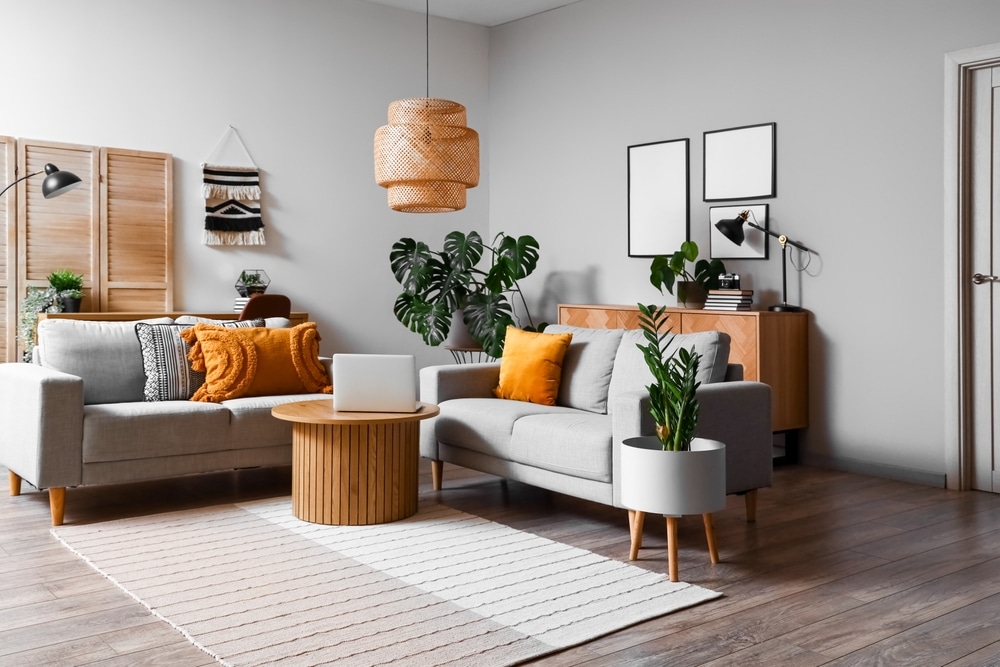
As we start a new year, 2025 color trends have already kicked in, reflecting a year of thoughtful introspection and bold reinvention. With so many societal shifts and design innovations guiding interior color palettes, the hues we’re seeing this year go beyond surface-level aesthetics. They are carefully curated to represent the modern balance between serenity and vibrancy, tradition and modernity. Let’s see how these 2025 paint color trends are shaping our spaces.
Earthy neutrals and grounded tones
Earthy tones are making a strong comeback in 2025. Think soft browns, warm taupes, and calming beiges. These are colors that bring a sense of serenity and connection to nature. We’re seeing shades in Sherwin Williams 2025 capsules like “Grounded,” “Sealskin,” and “Mexican Sand” take center stage, offering a peaceful atmosphere that’s all about creating a sanctuary.
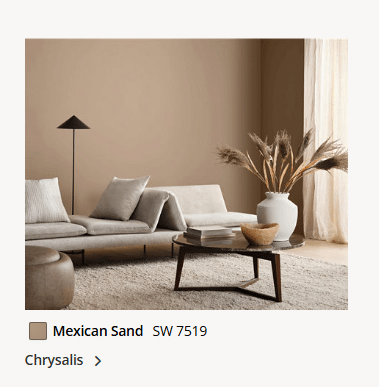
Mexican Sand, from Sherwin Williams Chrysalis capsule
These hues are rooted in natural materials, bringing homeowners a sense of calm that’s perfect for today’s world, where minimalism and sustainability are increasingly valued.
Everyone knows how good it feels to take a break from city life and head out into the wild, surrounded by earthy tones and natural beauty. These colors bring that same sense of peace into our homes, giving our spaces that “nature’s embrace” feel.
Rich browns and beiges like Sherwin William’s “Shiitake” and “Tanbark” are also gaining a lot of popularity this year. They work perfectly in both residential and commercial spaces, adding an understated elegance to any room. The beauty of these shades? They never go out of style, offering timeless appeal whether used on walls, furniture, or as accent pieces.
You can see how they can work out in any room (day or night) here.
Warm, rich hues: Mocha Mousse and Cinnamon Slate
If you’ve been craving something a little cozier, 2025 has you covered with rich, indulgent hues like Pantone’s “Mocha Mousse” and Benjamin Moore’s “Cinnamon Slate.” Both of these have won Color of the Year for each brand, respectively.
These colors speak to a need for comfort and luxury, and there’s no denying how inviting they are. “Mocha Mousse,” Pantone’s Color of the Year, is a warm, velvety brown that feels like wrapping yourself in a soft blanket on a cold day. It exudes a subtle elegance and creates a soothing environment, perfect for making any space feel intimate and luxurious.
The name kind of says it itself, a cup of hot chocolate on a snowy evening? “Mocha Mousse” brings that same cozy vibe. It’s a truly versatile shade that works well in living rooms, bedrooms, and dining areas, creating spaces where you’ll want to linger a little longer.
Then there’s “Cinnamon Slate,” Benjamin Moore’s take on a warm, plummy brown. It offers a more sophisticated, earthy feel, with just enough depth to create a grounded atmosphere without feeling heavy. Paired with lighter accents, it can add richness to any space while still feeling comfortable and approachable.
Fresh and tranquil greens and blues
Greens and blues continue to reign in 2025 as colors that help us unwind and reconnect with the natural world. Think soft blues and gentle greens; they are hues that promote tranquility and relaxation.
Sherwin-Williams’ “Gallery Green“, a historic color related to the Victorian era and “Outerspace”, a mysterious blue with gray tones, are both fantastic examples, creating serene spaces that feel effortlessly calm and refreshing.
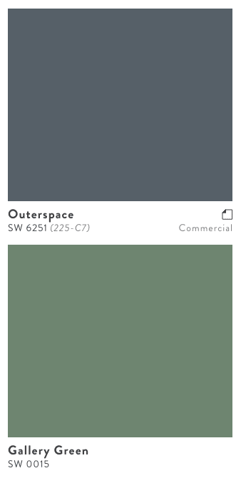
Sherwin William’s last 2025 Capsule colors “Gallery Green” and “Outerspace”
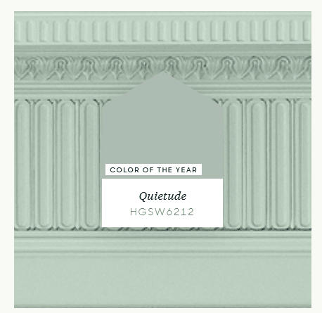
And if you’re looking for the ultimate in peaceful vibes, “Quietude” (Sherwin Williams’ Color of the Year) is a soft sage with blue undertones that has people talking. It’s perfect for bedrooms or spaces where you want to create a retreat from the busyness of everyday life. It’s like taking a deep breath of fresh air every time you step into the room.
Bold pops and electric tones
Giving a total 180° twist, we leave soft, muted tones behind and dive deep into bold pops and electric tones. While previous calm colors are making waves, electric hues are also shining through in 2025. Colors like Sherwin Williams’ “Dragon Fruit” and “Europich Lilac” are all around social media and contemporaneous designer pages.
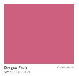
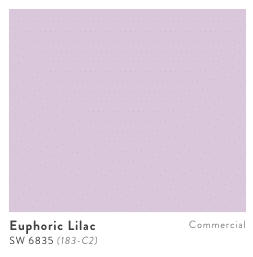
These colors inject energy and vibrancy into interior spaces, perfect for accent walls or decorative elements. These bold tones are a fun way to add some personality to your home, breaking up the more neutral shades with a jolt of color that feels fresh and modern.
One more great example could be Sherwin Williams’ ‘Wellspring’ capsule section, which includes “Borscht” (the name of a Russian plate made with beet,”, which is pretty similar to the color of this paint). This strong color can go pretty good with another less vibrant one.
Soft pastels and muted tones for timeless elegance
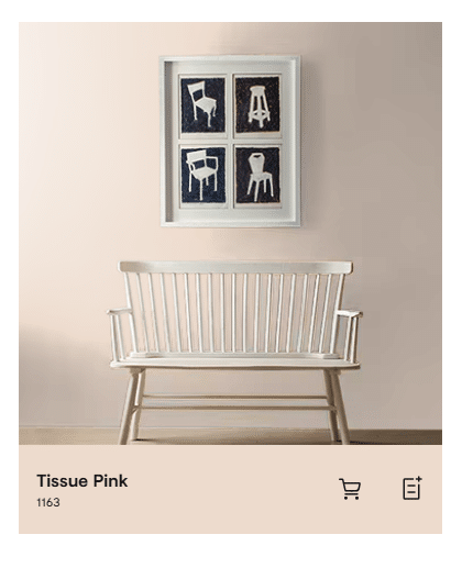
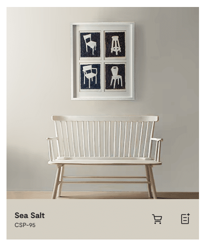
For those who prefer a more subtle approach, pastels and soft muted shades will continue to dominate in 2025. Colors like Benjamin Moore’s “Tissue Pink” and “Sea Salt” create an elegant, timeless atmosphere while still feeling fresh and modern. These shades work well in almost any room, offering a quiet sophistication that can fit with both classic and contemporary styles.
As we dive deeper into 2025, it’s clear that this year’s color trends are all about finding harmony—between nature and design, comfort and luxury, boldness and serenity. After that, the choice is always yours.
You might want to embrace earthy tones, luxurious deep hues, or playful pops of color. There’s a palette for every style.
Contact us here if you would like to find the best painting contractor for your residential or commercial painting needs.
What is the 2025 color of the year?
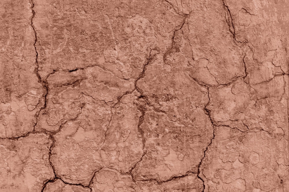
In 2025, leading paint brands have chosen their “2025 Color of the Year” selections to reflect current lifestyle trends, emphasizing wellness, mindfulness, and sustainability. These colors are an important part of the 2025 color trends, shaping how we approach design in the coming year. Let’s explore each brand’s choice and the reasons behind it.
Pantone: Mocha Mousse (PANTONE 17-1230)
2025 paint color trends bring Pantone’s selection first. For 2025, Mocha Mousse is a warm, rich brown reminiscent of chocolate and coffee. This color embodies “subtle elegance and sensorial richness,” offering a feeling of comfort and indulgence.
Laurie Pressman, Vice President of the Pantone Color Institute, notes that the color speaks to a desire for comfort and simple pleasures, inviting indulgence and sharing with others.
Sherwin-Williams: Quietude (HGSW6212)
Sherwin-Williams 2025 color of the year is Quietude. A cool, sage green with blue undertones. This hue promotes tranquility and serenity, aligning with the brand’s “Naturally Refined” collection, which emphasizes timeless, sustainable design. The selection reflects a shift toward creating spaces that foster well-being and a connection to nature. So, is green a color for 2025? For Sherwin Williams, most definitely.
Benjamin Moore: Cinnamon Slate (2113-40)
Benjamin Moore’s 2025 Color of the Year, Cinnamon Slate, mixes heathered plum and velvety brown. This color offers a refined, modern sensibility with a touch of timeless elegance. The selection reflects a desire for warmth and comfort in interior spaces, aligning with broader trends toward creating inviting and cozy environments.
Behr: Rumors (MQ1-15)
Behr’s 2025 Color of the Year, Rumors, is a deep ruby red that brings a sense of luxury and sophistication to any space. This striking shade is ideal for creating a dramatic yet inviting atmosphere, reflecting a trend toward bold, statement-making colors in interior design.
But how do these giants of the painting industry decide which colors are trending this year? What do they base their decisions on? These were the selected colors because of the following reasons:
- Incorporating wellness and mindfulness: The selection of these colors reflects a broader cultural shift toward wellness and mindfulness. Softer pastels and subdued hues, like Pantone’s Mocha Mousse and Sherwin-Williams’ Quietude, are inspired by meditation and self-care practices, promoting calm and relaxation in living spaces. These colors create environments that encourage mindfulness and well-being.
- Connection to nature: The rise of greens and blues, such as Sherwin-Williams‘ Quietude, reflects biophilic design principles, emphasizing a connection to nature. These colors evoke tranquility and harmony, bringing the outdoors inside and fostering a sense of peace and balance.
- Sustainability and eco-friendly shades: Brands increasingly emphasize sustainability in their color selections. Pantone’s Mocha Mousse and Benjamin Moore‘s Cinnamon Slate are earthy tones that align with eco-friendly design principles, reflecting a commitment to environmental consciousness. These colors are versatile and timeless, reducing the need for frequent updates and promoting longevity in design choices.
In summary, the 2025 Color of the Year selections from leading paint brands reflect a collective movement toward creating spaces that promote wellness, connect us to nature, and embrace sustainability.
2025 paint color trends
So, we’ve talked about how the 2025 paint color trends are more than just pretty hues for your walls—they’re deeply connected to who we are as a society right now.
You might’ve noticed the vibe this year is all about the balance between simplicity and luxury, calm and energy, nature and technology. It’s like we’re all trying to catch our breath after a whirlwind few years, and what better way to do that than with the colors we choose to surround ourselves with?
The rise of soothing shades like Pantone’s “Mocha Mousse” or Sherwin-Williams’s ” Quietude ” responds to our growing desire for calm. These colors don’t scream for attention; they whisper, give a space to breath, helping you relax and recharge.
With everything that’s been going on in the world, people are craving these soothing tones—greens, blues, soft browns—to give us a break and help us reconnect with ourselves. Everyone’s looking for that sanctuary right now, and these colors are like your personal retreat at home.
Then there’s the whole nature vibe. Greens and earthy tones are back in full force, and it makes sense, right? The pandemic showed us that our connection to the outdoors is something we’ve been missing. Sherwin-Williams‘ “Grounded” and Benjamin Moore‘s “Cinnamon Slate” bring those earthy vibes inside, letting us feel a little closer to nature.
But this comfortableness isn’t for everyone. Apart from these calming tones are the bold, playful side of things. Colors like Sherwin-Williams’ “Dragon Fruit” and “Euphoric Lilac” are popping up.
After the monotony of being indoors, a splash of vibrant color on your walls can spark creativity and energy, especially if you mix them with the calming tones around them. It’s all about finding the balance.
Sustainability is another thing we can’t ignore. As we all become more eco-conscious, paint brands are keeping that in mind, too. The colors we’re seeing this year align with a greater sense of responsibility to our planet. Eco-friendly, low-VOC paints are trending, and the earthy shades that are popping up reflect that same sustainability mindset.
So, in the end, 2025’s colors are all about feeling. They mirror the world around us—one that’s still figuring things out, but seeking balance, mindfulness, and a little pop of joy along the way.
Discover the Koehn Painting difference – contact us today for a free estimate and step into a vibrant, freshly painted home!
